
Makeover Monday: 2018 Week 19:
A Steve Wexler inspired Jitter Plot
- I don’t always jitter; but when I do, I use Excel
- The appearance of individual bins of jittered data
- Final touches
I don’t always jitter; but when I do, I use Excel: It’s like the one thing for which I consistently rely on Excel
Step one: Get the data into Excel if it isn’t already.
Two: Insert a new column and call it Jitter.
Three: Insert formula “=RAND()” & copy/paste for each row in the data.
Four: I like to replace the formulas with values. Otherwise, the values will change each time you open the file.
The appearance of individual bins of jittered data: What to do about the horizontal grid lines that span the entire viz
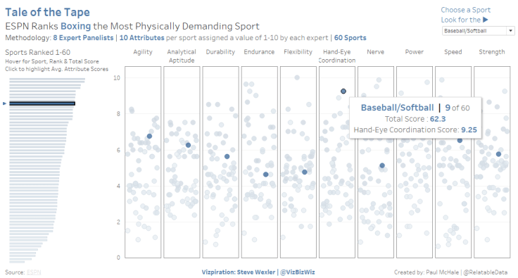
This dataset is made up of a series of attributes and scores for each. For my jitter plot, I created a column for each attribute. Each sport’s score for a given attribute is represented by the vertical placement of the point. The horizontal placement is dictated by the Jitter; it is random placement.
As learned from Steve Wexler [Data Revelations & @VizBizWiz], the jittering effect disperses the dots horizontally so as to reduce the overlap of points and make each dot visible.
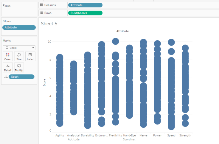
See the default layout for Attribute with and without SUM(Jitter) on the columns shelf and SUM(Score) on rows.

We have a lot of work to clean-up this Jitter view, though. For starters, let’s turn off all dividers, axes, tick marks, zero lines and grid line and see what a clean slate looks like. Let’s also hide the Jitter axis and field labels.
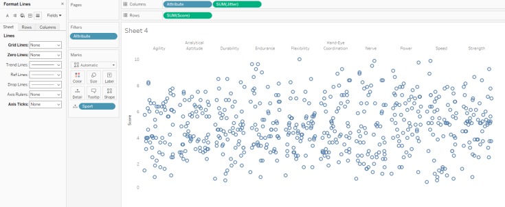
This view is a bit easier on the eyes; but, in the absence of all lines, the columns start to blend into a single plot. We also lose a bit of perspective for the vertical axis; particularly at the far right. My vision was to create 10 distinct bins, one for each Attribute or column, with a few horizontal grid lines included for perspective.
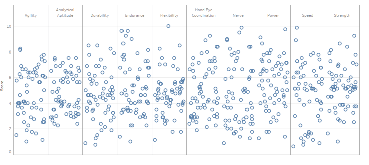
The immediate problem for the distinct-bins-with-horizontal-grid-lines idea is that the grid lines run continuously through the viz. It doesn’t exactly create the feel of unique bins. See the view below with horizontal grid lines and column dividers turned on.
My goal was to create the appearance of space between the columns. I took three steps to create this space.
Step One: I set the column dividers to white and the thickest line. This creates the appearance of space as the thick white column dividers will cover the horizontal grid lines.
Two: I turned on vertical grid lines and the horizontal zero line. Tip: be sure to use the same grey for both so the look is constant. The resulting view will look like a mess; but, not to worry, step three with help.
Three: Lastly, I set the Jitter axis range and tick mark to ‘fixed’ and experimented to find the right balance in start, end, origin and interval. In my experience, finding the right range and tick origin and interval will take some trial and error. Ideally, you are trying to get the ends of the horizontal grid lines to align perfectly with the vertical grid lines. The beauty of 2018.1 is that the updates you make are reflected in the viz in real-time (not sure if this was the case in 10.5; it’s getting hard to keep up with new features:-))
Here’s where I landed for this viz:


Final touches: Attention to detail down the home stretch
By default, the horizontal zero line is off-center with the 0 label. I haven’t missed this off-center 0 since Andy Krieble (@VizWizBI) called me on it in a Makeover Monday Viz Review. Here is a look at the default view side-by-side with the ideal state.


There is a simple solution to align the 0 with the line. Edit the vertical axis and set it to fixed. Then change the starting point from 0 to -.2. -.2 works in this case because the max value on the vertical axis is 10. You’ll need to adjust the starting value based on the max value.
You might have noticed, though, that there is a drawback in this case when adjusting the starting value of the vertical axis; the vertical grid line will then extend below the horizontal zero line. I solved this by adding a floating text box with a white background to the dashboard. I positioned it just below the horizontal zero line to cover the vertical grid lines.
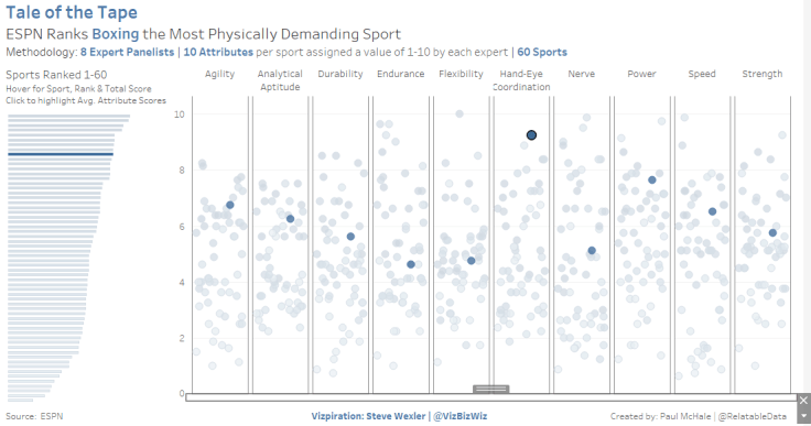
With the end in sight, it’s time to make some decisions on color. I default to blue and grey on every viz I create. Oftentimes, I find good reason to change those colors; but, in this case I opted to keep the blue and grey because they reminded of the branding used on Steve Wexler’s website. His work was the inspiration for this dashboard, after all.
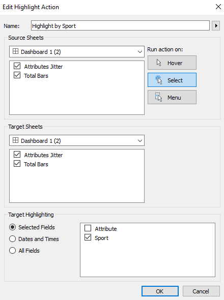
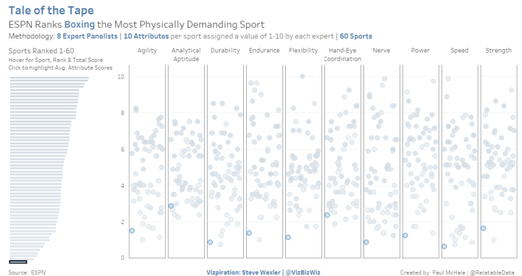
Planning to add a highlight action to the dashboard, I knew it would be hard to see the lighter blue dots. I added a blue border to each circle so the lighter circles would be visible when highlighted. The action is a simple click-to-highlight with Sport selected as the target.
Hope you found this to be informative or, at the very least, interesting. Would love to hear how you may have addressed similar ideas/circumstances differently.
Thanks as always for reading. You can find me on Twitter @RelatableData.

Leave a comment