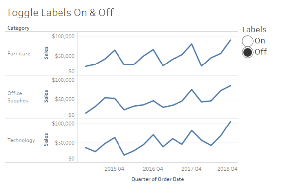
How to use a sheet swap to give your users the ability to toggle labels on and off in Tableau.
Toggle Labels On & Off in Tableau
Data to the people
How to use a sheet swap to give your users the ability to toggle labels on and off in Tableau.
It is important to understand that chart-building is merely one step in the process of effectively communicating data. Let's focus this discussion on going beyond default settings with a few quick tips to more effectively share that story.

As learned from Steve Wexler [Data Revelations & @VizBizWiz], the jittering effect disperses the dots horizontally so as to reduce the overlap of points and make each dot visible.

Give your labels some space In my recent post, MM Week 47: My First Custom Color Palette, I made mention of a few tips for labeling line charts to improve the user experience and promised a follow-up post with more detail. Interestingly, while researching for this post, I found a better solution than the one... Continue Reading →
I've been exploring gap charts of late and have frequently thought it would be great to assign a unique value to the first or last dot on each line. I recently had a burst of inspiration and thought I'd document the process in a blog post. Hope you find it helpful!
