Makeover Monday | 2018 W30 | OECD Paid Parental Leave
The 2018 Week 30 Makeover Monday challenge presented one of my favorite data viz opportunities – what I’ve called in a previous posts, gap charts. More commonly, these charts are referred to as dot plots or dumbbell charts.
- Use case for dot plots
- How to build a dot plot in Tableau
- Formatting best practices
Use case for dot plots: My first dot plot
I created my first dot plot about three years ago while working on a resource allocation dashboard for a group of program managers. The program managers were tasked with balancing actual hours worked with budgeted hours.
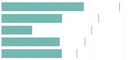
A bullet chart made a great visual in this scenario; clearly distinguishing between projects that were under and over budget. The bars represented actual hours billed and the bullet represented the budgeted hours. But after the company went through a sizable restructuring, we found ourselves in the unique situation where every project was under budget.
As a result, the bar was short of the bullet in every case. This diminished the value of the bullet chart. Instead of asking which projects were under/over budget, program mangers were asking how far under budget was each project. They were focusing their attention on the gap between the bars and bullets.
Adjusting to the changing needs of my audience, I redesigned the dashboard using a dot plot. Instead of directing my audience’s eyes to compare the lengths of the bars to one another relative to the bullet, I wanted instead to focus their attention on the space between the ends of the bars and the bullets. So, I replaced each bar and bullet with dots and connected the two dots with a line to represent the gap between budgeted and actual hours billed.

How to build a dot plot in Tableau: Recreating my MM W30 Viz
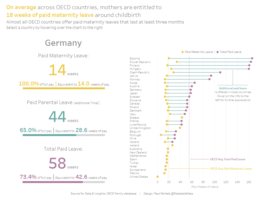
I no longer have access the dashboard described above, so I will use a recent #MakeoverMonday dashboard I designed using the 2018 W30 dataset, OECD Paid Parental Leave.
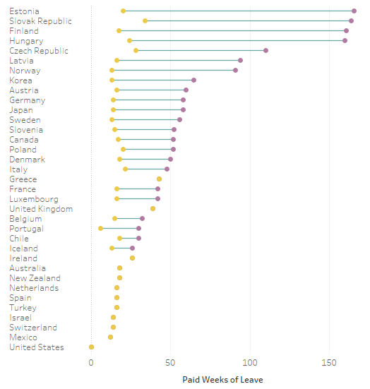
This dataset included two types of paid leave made available the new moms in OECD countries; maternity leave and supplemental leave options. I immediately thought to use a dot plot with the left dot representing maternity leave, the right dot total leave, and the gap (line) demonstrating supplemental leave.
Get the data here: MakeoverMonday Data Sets
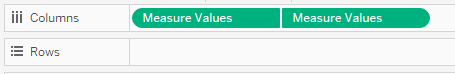
Measure Values
- Pull Measure Values onto the columns shelf and keep only the two measures of interest. In this case, SUM([Paid maternity leave in weeks]) & SUM([Total paid leave in weeks]).

- Then duplicate the Measure Value by holding CTL while selecting the Measure Values on the columns shelf and dropping directly tot he right.
Add a dimension
- In this case, add Country to the Rows Shelf. You should land with a view similar to this:
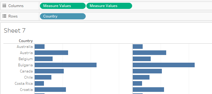
Chart Types
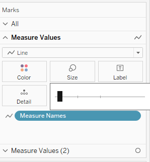
- Choosing Chart Types – Measure Values vs Measure Values (2)
- Measure Values needs to be set to Line
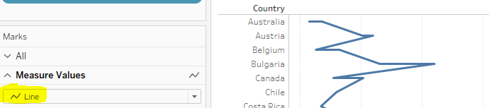
- Drag Measure Names to Path to get a single line per Country. This will represent the gap between the dots
- Measure Values (2) needs to be set to Circle

- Measure Values needs to be set to Line
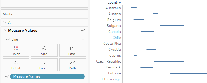
Dual Axis
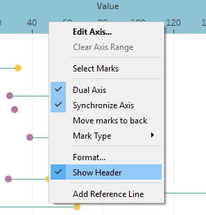
- Right-click the right Measure Values pill on the Columns shelf and select Dual Axis
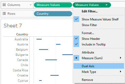
- Right-click the top horizontal axis and select Synchronize Axis.

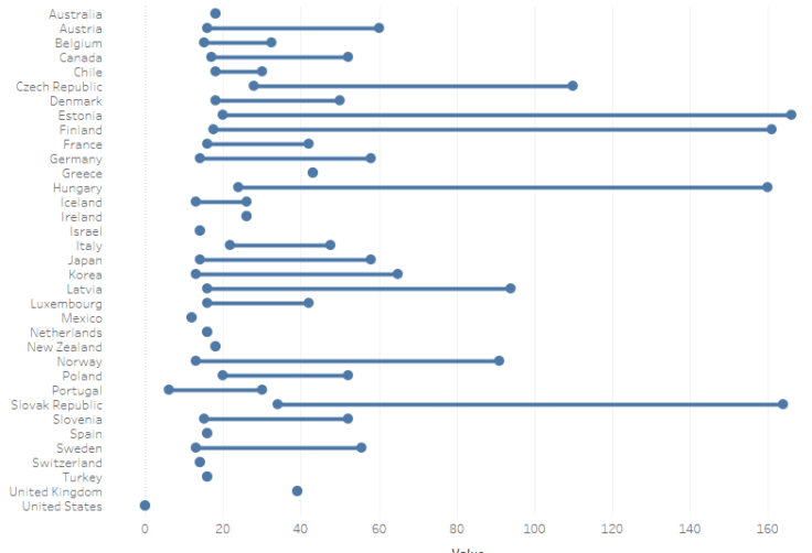
You now have a dot plot
Formatting best practices: Attention to detail
- Line color – Measure Values: Click Color on Marks card to select a color
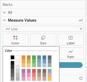
- Line thickness – Measure Values: Click Size on the Marks card and drag left
- Dot color – Measure Values (2): Drag Measure Names to color and choose colors


- Ensure SUM([Paid maternity leave in weeks]) is on top in the color legend. This will hide the purple dot when no additional leave is offered

- Hide top horizontal axis: Right-click top axis and uncheck Show Header
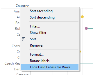
- Hide “Country” label: Right click “Country” and select Hide Field Labels for Rows
- Sort the Countries by SUM([Total paid leave in weeks]


- Remove row and column dividers

- Set tick mark interval to 50

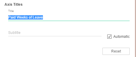
- Update axis label
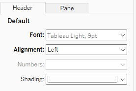
- Format Headers (Country Names)
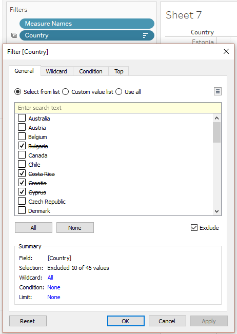
- Filter to exclude non-OECD countries and Averages. (Exclude Bulgaria, EU Average, Lithuania, Eurozone AVG, Romania, Croatia, OECD AVG, Cyprus, Malta, Costa Rica)
- Final dot plot
Closing thoughts
There is plenty more to write about regarding this dashboard, but we’ll have to hold-off on the text boxes, BANs, reference lines and bar charts for another post.
As always, please reach out via Twitter or leave a comment below with any questions or feedback you may have.
Thank you for reading!

Great post Paul. I really like how clearly laid out it is – perfect walkthrough for anyone new to this chart type. In addition, it’s great to read how and why you found the need to use this at work. Keep it up!
LikeLiked by 1 person
Thanks Charlie! You set the bar high with your TakeapartTuesday posts!!
LikeLike