Custom Hierarchies Thanks so much to Paul for inviting me to write a guest post on his blog! He's been a great coworker and mentor to me for the past few years, I have learned so much from him! I'm a data analyst working in a People Analytics group analyzing human data. We deliver insights... Continue Reading →
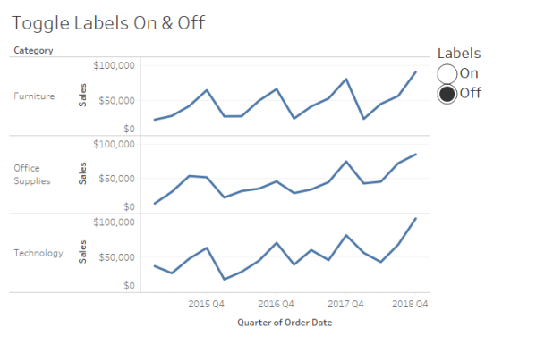
Toggle Labels On & Off in Tableau
How to use a sheet swap to give your users the ability to toggle labels on and off in Tableau.
Small Multiples: A programmatic approach to designing for multiple devices
Makeover Monday | 2018 W47 | Hours worked to pay mortgage Of the resources I come back to time and time again, Andy Kriebel's Tableau Tip Tuesday: How to Create Small Multiple Line Charts has to be near the top. The tip is so easy to implement, yet I realized this morning I hadn't taken the time... Continue Reading →
Communicate insights more effectively
It is important to understand that chart-building is merely one step in the process of effectively communicating data. Let's focus this discussion on going beyond default settings with a few quick tips to more effectively share that story.
Dot Plots in Tableau: How-to & Best Practices
How to build a create a Dot Plot in Tableau. Includes tips for formatting best practices
Using a Jitter Plot to Show Distribution
As learned from Steve Wexler [Data Revelations & @VizBizWiz], the jittering effect disperses the dots horizontally so as to reduce the overlap of points and make each dot visible.
How To: Unique labels on each end of your line chart
Give your labels some space In my recent post, MM Week 47: My First Custom Color Palette, I made mention of a few tips for labeling line charts to improve the user experience and promised a follow-up post with more detail. Interestingly, while researching for this post, I found a better solution than the one... Continue Reading →
Improve user experience by limiting the use of color
Revisiting my #MakeoverMonday 2018 week 2 submission | Looks vs. Personality In #MakeoverMonday 2018 Week 2, I built a gap chart to compare how men and women rank certain qualities in a potential partner. My goal was to highlight whether men or women across various countries were more likely to rank certain characteristics as most... Continue Reading →
Dynamic font color in a tooltip improves UX
My first dynamic colors in a tooltip, a new color scheme and an old reliable chart type.
Building a Gap, or Dumbbell, Chart in Tableau
Week 1 2016 addressed a table published by FiveThirtyEight.com. (Baseball, FiveThirtyEight & Tableau all in one place; how did I not know about this in 2016?)


