
MM 2016 Week 3: Consumers weigh-in on their intended technology
My first dynamic colors in a tooltip
My goal for this dataset was to implement my first dynamic colors in a tooltip. Along the way I decided to use a new color scheme and found my way back to one of the first chart types a learned after being introduced to Tableau.
- Bullet chart vs Slope chart
- A new color palette
- Conditional formatting for tooltip
Click to interact with tooltips

Bullet chart vs Gap chart vs Slope chart: Returning to my roots
Bullet charts were one of the first new charts I learned once I started using Tableau. I picked them up from Stephen Few in his book, “Information Dashboard Design“. It was my first data visualization read. I’ve been using bullet charts for a few years now, but more recently I’ve been experimenting with chart types I’ve learned since joining the #MakeoverMonday community.
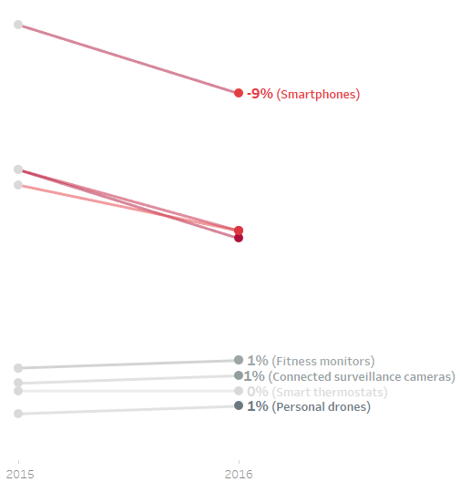
My first draft of this makeover was a slope chart, but I couldn’t get it just right. First, there was too much overlap in my labels. But, more importantly, when I sat back intending to solve to label problem, I realized a key piece of the story wasn’t as clear as it could be.
The top four items all declined significantly while the bottom four all stayed even or increased. Those top four fit into a ‘tradition technology’ bucket while the others were newer and could be bucketed as ‘innovative.’ While the slope chart demonstrated the change from 2015 to 2016, I didn’t find the story to be compelling. I decided there was too much overlap in the viz. I wanted to give each product it’s own space and the bullet chart suddenly seemed like the best option.
A new color palette: @AnnUJackson inspired, wife approved
I’ve worked mostly with custom color palettes of late. I blogged about my first custom color palette about a month ago; MM Week 47: My First Custom Color Palette. Before creating that first custom color palette, I had limited my color choices to blue, grey and orange (in that order). So when I decided to learn how to implement dynamic colors in my tooltip, I thought I should explore some other color options.
I love Ann Jackson’s designs for a number of reasons; I’m always impressed with her use of color. I haven’t yet developed a keen eye for pairing colors. I’ve had this fear in the back of my mind that I can’t stray from the blue, gray and orange unless I’m working with a brand (in which case someone else would have approved the colors).
But I decided to step outside my comfort zone a use a new color scheme. My wife Heather (she’s my first and best editor) made the final call on color choice and I couldn’t be happier with the outcome. My wife isn’t on Twitter, but if she was and only followed one member of the data viz community, I think @AnnUJackson would get the node over me:-)
Conditional formatting for tooltip: A short version of what was a long day
I decided to tackle this one mostly on my own. I recalled reading in the Tableau Community Forums some time ago that conditional formatting could be used to get dynamic colors in tooltips. I did some research and found the post I had read – the tip was from Tableau Kumar.
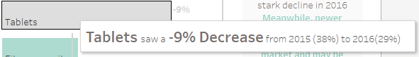
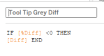
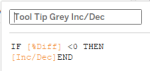
I created a lot of calculated fields and iterated quite a bit. Ultimately, I landed on six calculated fields to achieved the desired outcome; two calculated fields for each [Product], [Diff] and [Inc/Dec]. When [Diff] is less than zero, the tooltip displays grey; and when greater than or equal to zero, the 2nd color.
Here is the final outcome:

Here are the calculated fields:


I then formatted the tooltip as follows:
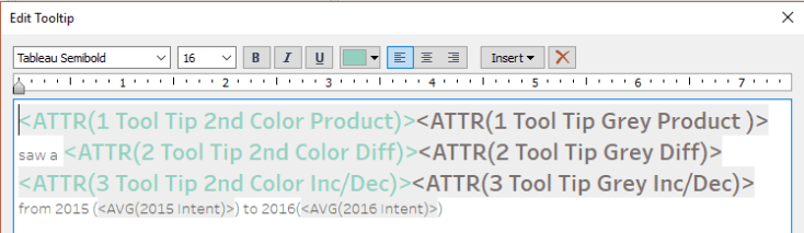
The key is to place the two [Product] calcs consecutively with no space between. The same is done for [Diff] and [Inc/Dec]. The conditional formatting tells Tableau which calculated field (color) to display.
As always, thank you for reading. I hope you found this to be helpful. Please share feedback and ask questions on Twitter @RelatableData.

Leave a comment