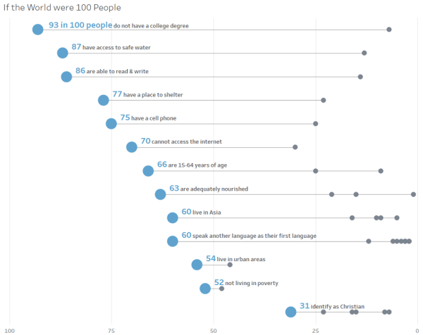
It is important to understand that chart-building is merely one step in the process of effectively communicating data. Let's focus this discussion on going beyond default settings with a few quick tips to more effectively share that story.
How To: Unique labels on each end of your line chart
Give your labels some space In my recent post, MM Week 47: My First Custom Color Palette, I made mention of a few tips for labeling line charts to improve the user experience and promised a follow-up post with more detail. Interestingly, while researching for this post, I found a better solution than the one... Continue Reading →
Improve user experience by limiting the use of color
Revisiting my #MakeoverMonday 2018 week 2 submission | Looks vs. Personality In #MakeoverMonday 2018 Week 2, I built a gap chart to compare how men and women rank certain qualities in a potential partner. My goal was to highlight whether men or women across various countries were more likely to rank certain characteristics as most... Continue Reading →
Dynamic font color in a tooltip improves UX
My first dynamic colors in a tooltip, a new color scheme and an old reliable chart type.
Quick tip: Use RANK for size and color
I've been exploring gap charts of late and have frequently thought it would be great to assign a unique value to the first or last dot on each line. I recently had a burst of inspiration and thought I'd document the process in a blog post. Hope you find it helpful!
Creating a Custom Color Palette in Tableau
For my Week 47 Makeover Monday –Demonstrating Snapchat’s growth relative to the competition.


