How to highlight the dots on either end of each line
I’ve been exploring gap charts of late and have frequently thought it would be great to assign a unique value to the first or last dot on each line. I recently had a burst of inspiration and thought I’d document the process in a blog post. Hope you find it helpful!
- Gap charts
- RANK
- Using Rank for color
Gap Charts: What are they?
I use gap charts when I want to demonstrate the variance in spread between different categories in my data. I typically use this to show a trend in open tickets at work; one set of dots represent total tickets and the other closed tickets. In this case the gap represents open tickets at any given time.
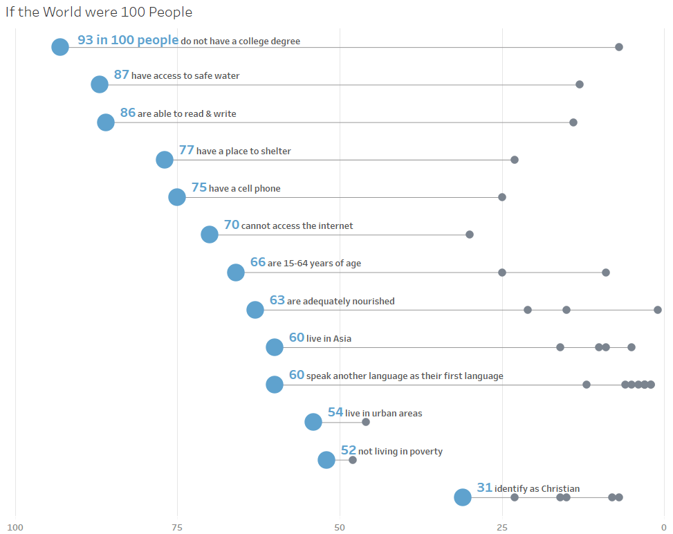
The inspiration for this blog came while working on the 100th Makeover Monday dataset; The World as 100 People. My goal was to show each category on separate lines with the value of each subcategory represented as a dot on the line.
In this case, I felt the story was centered on one side of the lines; the max value within each category. I wanted to highlight those dots by making the color stark and the size larger. Enter RANK.
RANK: What is it?
Rank is a table calc. Table calcs take into account only the values in view; think column and row totals. They can also be used for calculating differences from a given point as well as percent differences.
Rank is used to order points based on value. When used in the most simple form, to put values in ascending or descending order, they essentially sort the data. This realization (obvious as it may be) was the inspiration for this blog post.
(Further reading on table calcs courtesy of Andy Kriebel.)
Using RANK for color: How to color the first or last dot on each line?
Putting a rank table calc on color will default to a continuous color scheme; various shades of a single color varying from light to dark based on the rank. For this use case, the goal is to assign one color to the max value on each line and a second color to all other values. A calculation can be used to identify the maximum value on each line.
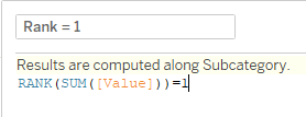
Step 1 – Create a calc similar to the one below. The text in the yellow highlight will likely read. “Results are computed along Table (across). This may or may not produce the desired result based on the data structure and viz layout. To ensure this tip works properly, follow step 2.

Step 2 – To ensure Tableau knows the dimension along which to rank the values, click the ‘Default Table Calculation’ link in the lower right of the calculation window (see below). Next, click the ‘Compute Using’ drop down and select the appropriate dimension for ranking the values.


Step 3 – Drag the pill for the new calculation onto color. Edit colors as needed. The same pill can then be added to size for further differentiation.
I recommend you toy around with ascending and descending options and explore Max() and Min() to take these ideas further.
As always, thank you for reading. I love answering question and getting feedback. Please reach out if you are interested in discussing further.

Leave a comment