
Makeover Monday | 2018 W47 | Hours worked to pay mortgage
Of the resources I come back to time and time again, Andy Kriebel’s Tableau Tip Tuesday: How to Create Small Multiple Line Charts has to be near the top. The tip is so easy to implement, yet I realized this morning I hadn’t taken the time to understand how it really works. Now a few hours later, I’ve documented what I learned and implemented a parameter solution for changing the number of columns.
- Andy’s Calculations
- A programmatic approach to building a mobile view
- A few quick Device Designer tips
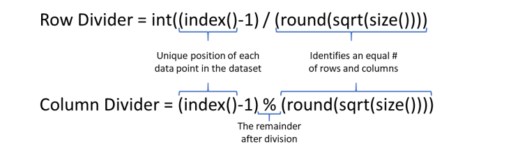
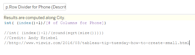
Andy’s Calculations: Do these calcs even reference the data???
Between my Tableau Public profile and dashboards created at work, I’ve used these two calculations in at least four vizzes prior to this week’s Makeover Monday. This morning, I found myself stuck trying to reduce the number of columns in my view, but I didn’t want to resort back to adding data for column and row placement in the data source.
I eventually realized the solution lied in replacing the denominator with a parameter. Before we jump into the parameter solution, let’s take a closer look at these calcs.
What is (round(sqrt(size)))???
Essentially, (round(sqrt(size))) takes the square root of the number of rows (count of cities in this example) and rounds to the nearest whole number to identify the number of rows and columns to best fit the data.
In this case, with 97 cities, the square root of 97 is 9.849, which rounds to 10. 10 is a nice neat example because it is easy to see that 97 cities will fit nicely in the 100 spaces you get with 10 rows and 10 columns.
OK… and what does % mean here?
For those not familiar with this syntax, think back to when you first learned long division. Not all pairs of number are evenly divisible; in most cases, their is a remainder. The % indicates we are dividing, but only keeping the remainder.
For example, if we were dividing 87 by 10, 10 divides in 87 8 times (not concerned with the 8 here) with a remainder of 7.
To simplify: 87/10=8.7 | 87%10=7
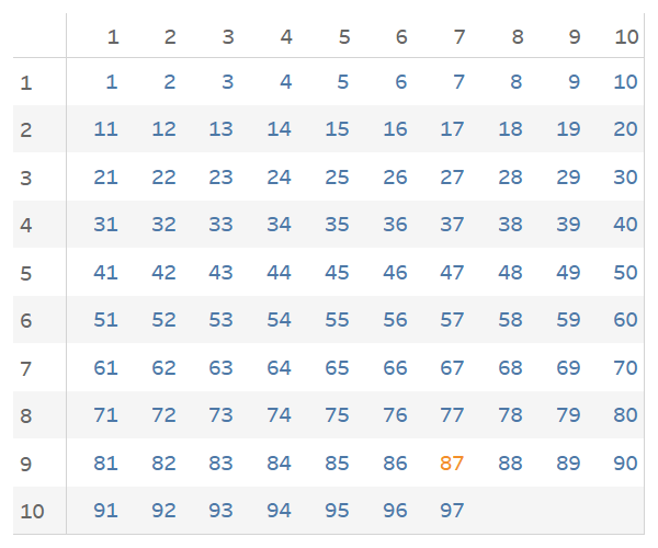
This would yield a Row # of 9 and a Column # of 7. So, the 87th record would sit in the 9th row and 7th column as demonstrated below.
A programmatic approach to building a mobile view: Adding the ability to quickly change the number of columns
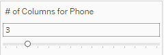
My key takeaway from TC18 was a commitment to leverage Device Designer and build Desktop, Tablet, and Phone views for all of my dashboards. As such, I found myself stuck this morning as I attempted to reduce the number of columns from 10 to 3 for an ideal Phone layout.
Once I wrapped my head around how these calcs worked, I realized I could create a parameter to replace round(sqrt(size())) in the denominator.
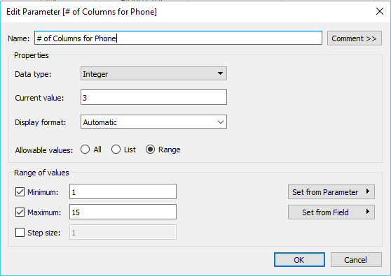
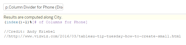
After some iterating, I landed on separate parameters for the Tablet and Phone views. The parameters are referenced in separate Row and Column calculated fields for each device type.
A few quick Device Designer tips: More to come in a future post
I’ve been documenting my journey with Device Designer and plan to pull my learnings into a post in the near future. For now, a few notes to help implement this solution.
If you download my workbook from Tableau public, you will see my Default dashboard is a bit of a mess. It contains all three versions of my dashboard and is not laid out in any meaningful way. Since I have developed views for all three device types, the default view will never be seen by a user. Instead, Tableau will identify the best view from the three device types based on the dimensions of the screen on which the dashboard is opened.
Since I placed all three versions of my dashboard in the default view, I have the ability to place them appropriately in the three device views (one per device view). The parameters allowed me to quickly test different numbers of columns in each view without changing the other views.
Here you can see the Tablet and Phone views.


As always, thanks for reading. I appreciate any feedback you have. Please find me on Twitter @RelatableData.
 Relatable Data