
Tips for immediate improvement
Business intelligence and chart-building software have become ubiquitous at all levels of nearly every organization. There isn’t an analysts out there who doesn’t have access to at least one piece of software that can build various chart types with a near endless array of formatting options; think Microsoft Excel.
However, it is important to understand that chart-building is merely one step in the process of effectively communicating data. Most software on the market have made strides toward improving default settings, but the analyst still plays a role in exploring the data to uncover and then share the story in the data. Let’s focus this discussion on going beyond default settings to share that story.
So, what can you do differently starting today to more effectively communicate the story in your data? (Note, there are exceptions to each tip outlined here.)
- Ditch the vertical bar charts
- Limit the use of color
- Include Big Angry Numbers (BANs)
Ditch the Vertical Bar Charts: Most languages are read left-to-right, not bottom-to-top
Reading left-to-right is natural for the vast majority of our audiences. So, why not present our information in a manner that is intuitive to our audience? Consider the two charts below.


These charts display the same information. The argument in favor of horizontal bar charts is not that they are more accurate; accuracy is the minimum standard when sharing data. The case for horizontal bars is that they reduce the cognitive load on your audience’s mind.
Other considerations with bar charts:
- Use labels judiciously. Either label the bars or include an axis with labels and grid lines. Including both is redundant and can be distracting
- When labeling the bars, it can be comforting to the more skeptical members of you audience if you make a point to label the vertical axis as zero. (Note how this is done in the charts above)
- Why? See the next tip to understand why this skepticism is warranted
- Always start your bar charts at zero and let your audience know you did so
- It is not uncommon, particularly in cable news, for those intending to mislead their audience to start their bar chats at some value other than zero
- Bar charts work so well for relaying data because humans are good at comparing the sizes of flat-edged, two-dimensional areas
- When a bar chart starts at some value other than zero, that perspective is skewed
- Bar charts work so well for relaying data because humans are good at comparing the sizes of flat-edged, two-dimensional areas
- It is not uncommon, particularly in cable news, for those intending to mislead their audience to start their bar chats at some value other than zero
Limit the use of color: Use color to direct the audience’s attention, not to distinguish dimensions
I first learned about the iconic memory reading “Storytelling with Data” by Cole Nussbaumer Knaflic. The iconic memory captures and filters information to be sent to the short-term memory. Color is one of a number of preattentive attributes we can use to capture the iconic memory’s attention.
We’ll want to avoid the urge to go over board with preattentive attributes, however, because the short-term memory can only hold about four pieces of information at a time. If we ask the short-term memory to account for the meaning of four or more colors, we are essentially fully taxing our audience’s ability to interpret the actual data.
So, how should you approach color? I like to start with grey and add blue where I intend to drew the audience’s attention. Often, I’ll include a third color, but I never do so without good reason. In fact, I scrutinize the need for each addition color added to my viz more so than I did the previous.
Here is an example of reducing color I’ve been using in some of my talks. Note how the pie chart requires the use of numerous colors and a legend to distinguish the segments. This is just one reason I don’t create pie charts.


Other considerations for color:
- An alternative to using a legend: Consider using color in the heading, sub-heading or annotations to match the colors used in the viz
- Instead of asking you audience to look back and forth between the viz and a legend, let the text in your viz act as a legend
- Continuous values: When using color saturation to distinguish continuous values (think light blue for small numbers and dark blue for big numbers), it is best practice to use a single color when all numbers are positive; use two colors to distinguish between negative and positive
Include Big Angry Numbers (BANs): What’s the one number your audience has to see? Make it BIG!
Big numbers are eye catching; the research says so. See Amy Alberts’s and Andy Cotgreave’s webinar: Eye Tracking: What it teaches us about dashboard design
So, how do we handle BANs? Place the must see number in a prominent place where your audience can’t miss it. For a single number, consider placing at the top left. For a series for three or four numbers, either across the top or down the left side. Combining color, proximity and BANs can go a long way toward delivering your message clearly.
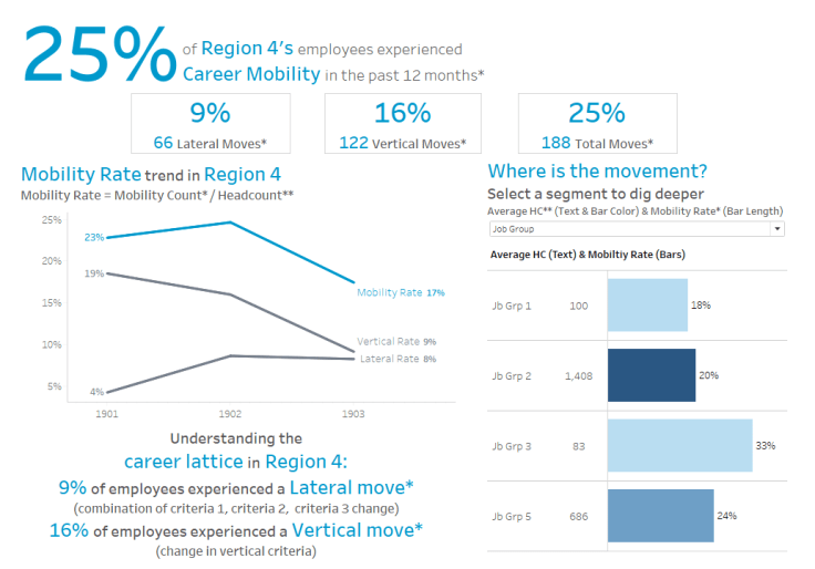
Another example from some of my recent talks:
Hope this is helpful! As always, thank you for reading!!! Find me on Twitter @RelatableData

Leave a comment