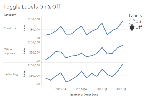
How to use a sheet swap to give your users the ability to toggle labels on and off in Tableau.
Toggle Labels On & Off in Tableau
Data to the people
How to use a sheet swap to give your users the ability to toggle labels on and off in Tableau.

It is important to understand that chart-building is merely one step in the process of effectively communicating data. Let's focus this discussion on going beyond default settings with a few quick tips to more effectively share that story.

Give your labels some space In my recent post, MM Week 47: My First Custom Color Palette, I made mention of a few tips for labeling line charts to improve the user experience and promised a follow-up post with more detail. Interestingly, while researching for this post, I found a better solution than the one... Continue Reading →

Week 1 2016 addressed a table published by FiveThirtyEight.com. (Baseball, FiveThirtyEight & Tableau all in one place; how did I not know about this in 2016?)
For my Week 47 Makeover Monday –Demonstrating Snapchat’s growth relative to the competition.
