
Makeover Monday 2016 Week 1
I found the Makeover Monday community in July 2017, so I’ve been participating now for about 20% of the two year long project. That’s measured in time, not number of submissions; I admittedly have ground to make-up in terms of participation rate. Nevertheless, I’ve decided to challenge myself to go back and build a viz for each dataset from the start.
Week 1 2016 addressed a table published by FiveThirtyEight.com. (Baseball, FiveThirtyEight & Tableau all in one place; how did I not know about this in 2016?)
Source
The article, Bryce Harper Should Have Made $73 Million More, calls attention to the relationship between player salary and a stat called WAR,or Wins Above Replacement, and assigns a dollar amount to the player’s ‘true’ calculated value. It’s a fascinating article and I recommend it for any baseball fan.
From a data viz perspective, the article focuses on Bryce Harper’s 2015 salary vs his 2015 WAR. Based on this analysis, Harper was underpaid by $73 million in 2015; the greatest single-season discrepancy in absolute dollars between a player’s salary and his calculated value.
As interesting as this is, I found myself more interested in the players who appeared on the list multiple times. My goal for this dataset was to build a viz that highlights the greatest discrepancies over time. For instance, Mike Trout of the Los Angeles Angels appears in the top seven an astounding four times, including the second, third and fourth spots directly behind Harper’s 2015 season.
Goals
To accomplish this goal, I decided on a gap chart filtered by Player, whereas the original table was filtered by Player and Year. I wanted all four of Mike Trout’s Years to top the list as opposed to placing Bryce Harper’s single-season record at the top.
Here’s what I came up with. Read on for my step-by-step.
Click to view interactive version

Gap Chart
The gap chart is built by placing the same measure on columns twice, setting the left pill to Line and the right to Circle. To get the two charts to overlap, right click the second pill and select ‘Dual Axis’. Then, to ensure the lines and circles line-up, right click the top horizontal axis and select ‘Synchronize Axis’.


Sort
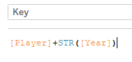
My solution for first sorting Player’s by Total Surplus, and then further sorting multiple Years by a single Player in order of Surplus is a bit of a hack. I created a calculated field named Key. I needed a unique identifier by row, so I combined Player and Year.
Add Players, Key, Year & Team to rows and place Surplus on the Details shelf. Then set Players and Key to sort descending based on Surplus.


Sorting Player by Surplus puts each Player in the desired order, but leaves the four Mike Trout Years out of order. Sorting Key corrects for this. (Would love feedback on other ideas for this hack:-))
Label
To get different dimensions and measures at each end of the line, I set-up the labels for each Measure Value pill separately. The logic to labeling a single end of a line is a little different than labeling only one of the two circles. I’ll add additional details in the near future; but for now, I’ve included some screen shots that should get you there if you are attempting to duplicate or follow along.


Size & Color
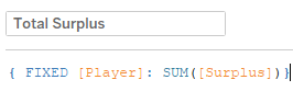
Since my goals was to highlight each players total Surplus, I created a calculated field called ‘Total Surplus’. Because Player is on the column shelf, sorting by Surplus produces the desired effect as though the sort is fixed on Player. For color and size, however, an LOD is required to tell Tableau to account for Total Surplus by Player.
Adding Total Surplus to Size and Color to calls attention to those players who appear on the list multiple times and helps to distinguish those Players from one another.
Annotations
I recently blogged about my goals and highlighted Labels and Annotations as areas of opportunity (So Many Ideas: Priority #1 – Get Organized). Even still, I only added these annotations after my beautiful and patient wife (no sarcasm here – she is my first and best editor) informed me that she had no idea what order these lines were in. To help the audience interpret the viz, I drafted annotations for Trout and Harper to explain that Trout has the greatest Surplus over a span of four Years, but that Harper held the single-season record. I hope they help:-).
Final Takeaways
In the end, Harper appears much lower on my list than he did in the FiveThirtyEight article, but I tried to still make clear that his 2015 season stands above all other single-seasons in history. Mike Trout, Josh Donaldson, Paul Goldschmidt and Ben Zobrist take the top spots in my viz given their Surplus over multiple seasons.
As always, thanks for reading! Please reach out on Twitter @RelatableData with questions or feedback.

Leave a comment